Overlaying events on time charts
The events output can be overlaid on a timechart to produce a single visual output. You can imagine the resulting visualization as having two layers.
Chart overlays must observe the following rules:
- Only charts with the same X axis may be overlaid.
- The top or overlaid chart will create a second Y axis on right hand side of chart.
-
Only the title of the bottom chart will display; the title parameter of the top chart will be ignored.
-
Create two flows: one that ends with view events and one that ends with view timechart.
-
Give an
-idparameter to your view timechart, with any arbitrary string as its value.All visual outputs accept an
-idparameter, but currently only view timechart supports overlays. -
Give an
-onparameter to the events view, with the value of your time chart's ID.
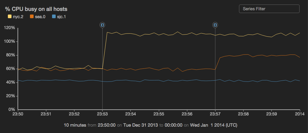
Example: Overlay two series of "git merge" events on a timechart showing CPU load
const spiketime1 = :7 minutes before 2014-01-01:;
const spiketime2 = :3 minutes before 2014-01-01:;

reducer spike_cpu(valfield,hostname,time) {

    // workaround for PROD-5118, once its fixed we can remove this const redefinition
    const spiketime1 = :7 minutes before 2014-01-01:;
    const spiketime2 = :3 minutes before 2014-01-01:;

    var spike1 = 0;
    var spike2 = 0;
    var val = 0;

    function update() {
        if (*time > spiketime1) {
        spike1 = 1;
        }
        if (*time > spiketime2) {
        spike2 = 1;
        }
        if ((*hostname == "nyc.2") && spike1 != 0) {
        val = *valfield + 0.5;
        } else {
        if ((*hostname == "sea.0") && spike2 != 0) {
            val = *valfield + 0.2;
        } else {
            val = *valfield;
        }
        }
    }

    function result() {
        return val;
    }

}

read stochastic -source 'cdn' -nhosts 3 -from :10 minutes before 2014-01-01: -to :2014-01-01: -source_type 'metrics' name = 'cpu'
|filter name = 'cpu'
|put value=spike_cpu(value,host,time)
|  view timechart
     -valueField 'value'
     -keyField 'host'
     -yScales.primary.tickFormat '%'
     -title "% CPU busy on all hosts"
     -id 'CPU';

emit -limit 1 -from spiketime1
| put title = "title",type = "git",text = "Enable new CPU-consuming service in New York",label = "git merge"
| view events
    -on "CPU"
    -typeField "type"
    -timeField "time"
    -messageField "text"
    -nameField "label";

emit -limit 1 -from spiketime2
| put title = "title",type = "git",text = "Something that thrashes the CPU in Seattle",label = "git merge"
| view events
    -on "CPU" -typeField "type"
    -timeField "time"
    -messageField "text"
    -nameField "label";
Comparing data from different intervals
Sometimes you want to compare data from different time periods by overlaying them in one time chart.
For example, imagine you want to see November's daily online store purchases compared to December's in order to see how they're affected by the Christmas holiday. You can do this with the -duration and -overlayTime parameters.
You can see this feature illustrated in the examples below.
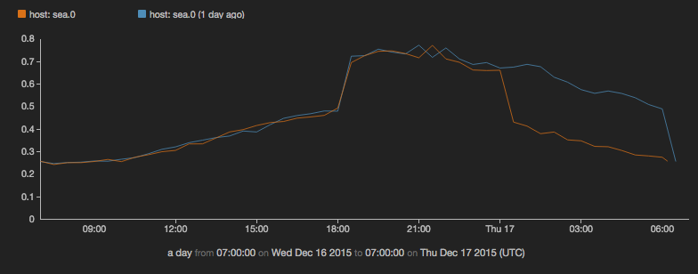
Example: Compare yesterday's CPU usage with usage today so far
read stochastic -source 'cdn' -source_type 'metric' -last :2 days: -daily .5 name = 'cpu'
| view timechart
    -duration :1 day:
    -overlayTime true
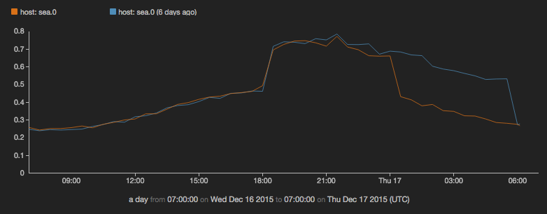
Example: Compare CPU usage from today with the same day last week
(
read stochastic -source 'cdn' -from :7 days ago: -to :6 days ago: -daily .5  -source_type 'metrics' name = 'cpu';
read stochastic -source 'cdn' -from :1 days ago: -to :now: -daily .5  -source_type 'metrics' name = 'cpu'
)
| view timechart
    -duration :1 day:
    -overlayTime true